Analytics
Settings → Analytics turns your tickets and activity into charts and exportable tables. It spans every project you can see, or narrows to a subset, over a date range.
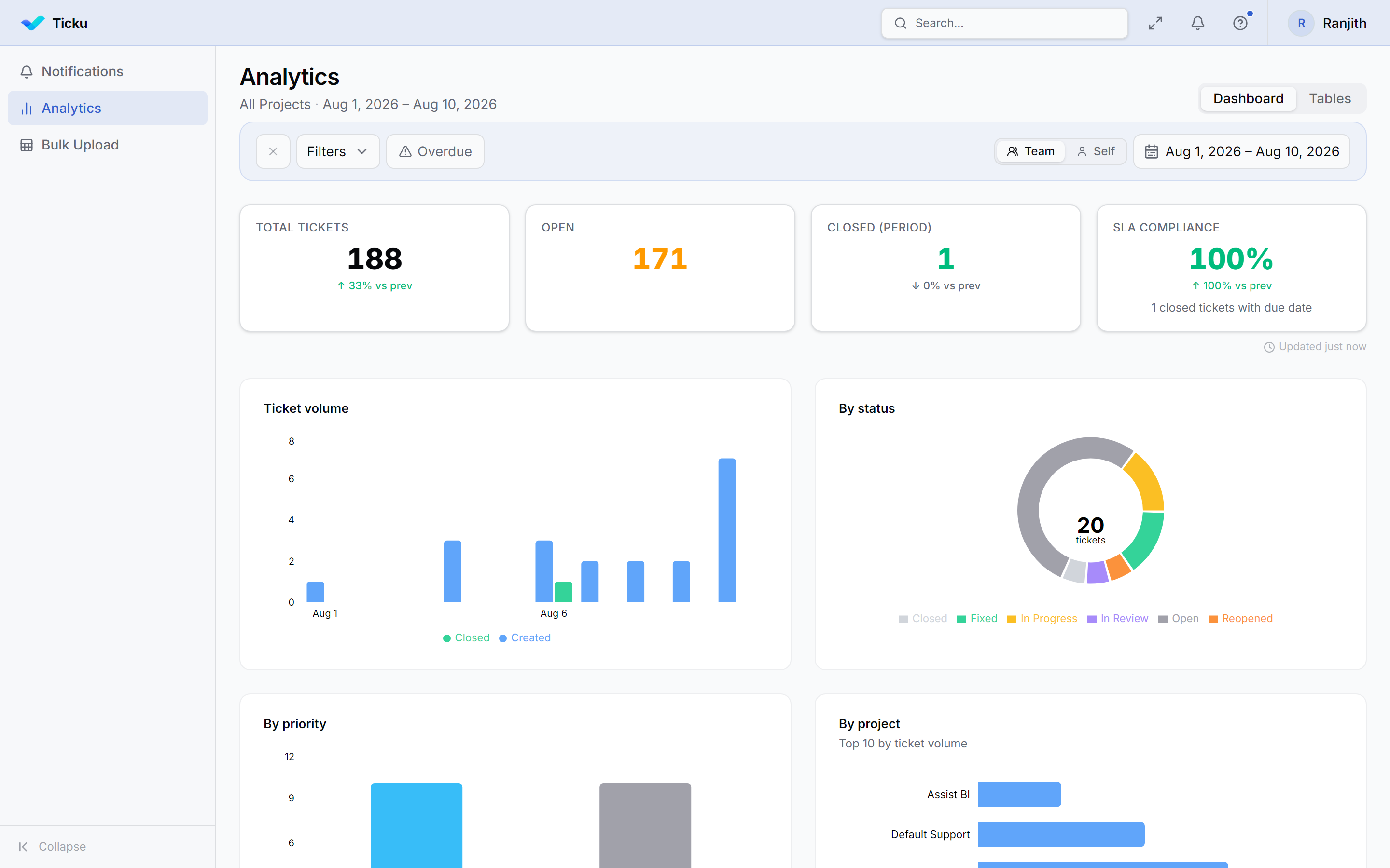
Two views
A toggle at the top right switches between:
- Dashboard — headline KPIs and charts
- Tables — the same data as row-level tables, built for export
Scope & filters
| Control | Options |
|---|---|
| Projects | All accessible projects, or a selected subset |
| Date range | An explicit window, shown next to the title |
| Self / Team | Your own work, or the whole team's |
| Status / Priority | Filter to specific values |
| Assignee | Focus on one or more people |
| Overdue | Only past-due tickets |
Dashboard
Four KPI tiles head the view — Total tickets, Open, Closed (period), and SLA compliance — each with a comparison against the previous period of the same length.
Beneath them:
| Chart | Answers |
|---|---|
| Ticket volume | Created vs closed over time |
| By status | Distribution across ticket statuses |
| By priority | Distribution across priorities |
| By project | Top 10 projects by ticket volume |
| Resolution time | How long tickets take to resolve |
| Needs attention | Overdue, at-risk, and escalated tickets |
| Top assignees | Who's handling the most work |
Tables
Six row-level tables, each openable on its own:
| Table | Contents |
|---|---|
| Activities | Recent actions — created, updated, status changed, commented |
| By Project | Per-project totals |
| Top Assignees | Per-person totals |
| Ticket Volume | Created vs closed per day |
| Worklog | Logged time by person and project |
| Work Schedule | Planned work per assignee — project, ticket, planned start and end, status, priority |
Work Schedule answers "who is booked on what, and when" — it's the planning counterpart to Worklog's record of what actually happened.
Exporting
Any table can be exported to Excel. Pick which columns to include, then a style template:
| Template | Look |
|---|---|
| Simple | Plain table with bold headers |
| Professional | Coloured header, zebra rows, frozen header |
| Executive | Dark header, gold accents, summary-ready spacing |
| Compact | Tighter rows for dense operational exports |
| Monthly Timesheet | Consultant header, daily hours grid, monthly totals footer |
Monthly Timesheet is a different shape from the others: rather than one row per record, it lays out a daily grid — date, day, tickets worked, hours, actual hours — summing hours per day across whichever tickets were touched. The date column is the row identity and can't be hidden. There's a PDF version of it as well.
Status summary email
From Analytics you can send a status summary — a snapshot of the current picture — by email to stakeholders.
:::note Tenant-scoped Analytics only ever reflects the active tenant. Switching tenants shows that tenant's data; nothing crosses the boundary. :::